Update 26 Jan 2015:
- We have a volunteer developer working on adding social media buttons to the Vector skin.
- It's possible we'll want to implement VisualEditor in the near future. This currently only works with Vector and Monobook (out of the 4 skins available to Wikipedia users).
- There is a skin called Readable/ used on this MW+SMW site. It is very light and clean, very easy to read, and good for people not used to wikis. However it presumably doesn't work with VisualEditor.
Older proposals[edit | edit source]
MediaWiki skin[edit | edit source]


This page is for discussion and collaboration on improving the user experience (UX) on Appropedia. This includes look and feel, and navigability.
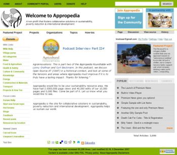
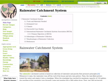
Appropedia is working on a new skin. See:
- Drafts of what the new skins might look like - see image on right, and the Photoshop file (you'll have to close the casino ads - please pardon these, and let us know on the talk page if you know a better free file host for large files).
- Main Page tests
Resources[edit | edit source]
- mw:Manual:Skinning - instructions on how to create a skin for MediaWiki.
- Curt has bought a copy of MediaWiki Skins Design by Richard Carter.
- Who in the Appropedia community understands skins and can spare a few hours to help? Or even less, to help with specific questions.
- Contrast checker
Picking colors[edit | edit source]
- Help us pick our site colors - Appropedia community blog.
- Why Programmers suck at Picking Colors - suggests:
- that a "better way to model color is the HSV color space (sometimes called HSB: hue, saturation and brightness): most color-picking dialogs of graphic programs have an HSV mode and it's clearly much better than RBG because it allows you to easily go back to the 'linear contrast' strategy by just changing the brightness and keeping hue and saturation fixed."
- the NASA color picking approach - although this is more for functional interfaces rather than attractive skins. Could be useful for aspects of Appropedia's development in future.
Examples of nice MediaWiki skins[edit | edit source]
- http://www.mailpress.org/wiki - note the softer appearance, and collapsible elements in sidebar. (Good as long as they're lightweight, and still usable for users without javascript.)
- http://www.grassrootswiki.org/
Comments and suggestions[edit | edit source]
- Think about which links we want to make prominent. E.g. making "edit" very prominent may help emphasize the reader's ability to edit and escourage people to take that step. (Note how prominent it is at https://aboutus.com.)--Chriswaterguy · talk 04:the 02, 13 March 2008 (PDT)
- Green is a very common color, esp on sustainability-oriented sites. Could we use a textured brown, something like the current background? For narrow strips of color, we could experiment with a finer texture. --Chriswaterguy (talk) 20:53, 29 March 2008 (PDT)
- Then again, Tressie's new logos are very nice, with a blue-green thing happening that could give us a good choice of colors. --Chriswaterguy 20:31, 3 June 2008 (PDT)
- Serif fonts? --Chriswaterguy 20:31, 3 June 2008 (PDT)
- GrassrootsWiki looks nice, but simple. --Chriswaterguy 17:10, 5 December 2009 (UTC)
- I quite like the inverted headers at http://web.archive.org/web/20190903232009/http://developmentcommons.org/ - a green bar with white text. --Chriswaterguy 18:33, 6 January 2011 (PST)
Priorities[edit | edit source]
I'd like to suggest these aims and priorities in developing a skin. Feel free to edit them. --Chriswaterguy 19:21, 24 March 2009 (UTC)
- Simplicity (e.g. see WikiGender)
- Easy navigation
- Clear, easy to read, with an elegant choice of colors.
- searchbox at top? (Maybe start with new Wikipedia skin...)
- size = ... 160% of present size?
- profile page links visible without scrolling down (e.g. User contributions)
Rotating image-links[edit | edit source]
Near the top right of the fan wiki en.battlestarwiki.org is an image (usually of a character) which links to the relevant wiki article. The image changes periodically (and the link and link text along with it), or when following a link or doing a hard refresh. This could be good for us - rotating through featured projects and other featured pages. --Chriswaterguy 07:42, 17 April 2008 (PDT)
- I notice they don't have a logo at the top left the way most MediaWiki sites do, so this is probably the site logo, moved and somehow made to alternate. --Chriswaterguy 20:38, 3 June 2008 (PDT)
Starting from a skin other than Monobook[edit | edit source]
Nice clean skins:
- MistyLook skin for MediaWiki seen here - and has a matching WordPress theme: http://wpthemes.info/misty-look/ - unfortunately this seems not to be open source (only a $20 donation, but presumably we can't share it.)
- OpenIDNet MediaWiki skin for http://wiki.openid.net/ - less pretty, but tidy & could have useful code.
Tests on the dev wiki[edit | edit source]
Skin developers can be given admin privileges on the Appropedia dev wiki.
The skins are found at on the dev wiki at:
- Monobook.css
- Common.css The defaults for all skins
- Approdev.css However this is not active until someone uploads the relevant file(s) to the server.
(Question: the files are at 2 places, e.g. for Wikipedia they are at http://web.archive.org/web/20080206164505/http://en.wikipedia.org/style/monobook/main.css and en:MediaWiki:Monobook.css but for other skins, they are not necessarily in the MediaWiki space. How does this work, and which one(s) need to be changed, to change the skin?
- The list of all pages in the MediaWiki namespace. (Search for .css pages.)
To allow someone to display a skin without selecting it in preferences, add the appropriate suffix to the end of the url, &useskin=skinname where skinname is the skin name in lower case with no spaces. E.g.:
http://whatissustainability.org/Welcome_to_Appropedia&useskin=cologneblue
See more by editing your preferences file and clicking "Preview".
Wordpress themes for the blog[edit | edit source]
The Appropedia blog is using a lean code, loband theme: Appropedia's 13 theme for WordPress. Suggestions are welcome on how to make it better looking and leaner.
Wordpress theme resources[edit | edit source]
Themes:
- Valid CSS seems like it's probably important.
- Elegance - if we can move sidebar and logo left.
- google:free-WordPress-themes
- Free Wordpress Themes
- http://web.archive.org/web/20131227233136/http://themecorp.com/themes/cityscape/ - clean
- Darwin - A lean & clean WordPress skin.
How-tos:
- WordPress Codex
- WordPress Support Forum
- Choosing a WordPress Theme
- Designing WordPress Themes For the Slowing Web
- How Do You Choose a WordPress Theme?
- How to Move and Change the WordPress Sidebar
Tools[edit | edit source]
The Firebug extension lets you edit and debug HTML, CSS, and JavaScript from within Firefox.
Colors[edit | edit source]
Finding matching colors (based on uploaded image, e.g. logo):
Viewing colors:
- Hexadecimal Colour Codes for HTML - try out text and background colors & generate the hex code.
- Check that hex color code.
Color schemes[edit | edit source]
THe colors of the clear-blue-green logo (from Tressie) are:
- blue: 86aed5 and
- green: 54b680
Using these didn't seem to work well.
Color schemes suggested by the above tools are: suggestion and the color hunter (no link to results) suggests #000000 #3A3335 #707878 #F9FFFF #45C99A.
The actual colors used in the first draft of the Wordpress blog ("Appropedia's 13") are the following. I can't remember which set I based it on, but nn a couple of cases I halved the intensity, by dividing the RGB values, 2 digits each in the hex codes, by 2. Otherwise they were too pale for easy reading:
- unvisited links #1E674E - bright green-blue but half as intense. RGB values were halved (so 1E674E)
- visited links: #727A7A grey - half as dark
- background - white
For more details see Appropedia:User experience/New skin/Appropedia's 13 for WordPress style.css
[edit | edit source]
Web ring[edit | edit source]
In principle...[edit | edit source]
In conversations with Peter Campbell, we've discussed having a web ring for relevant green/dev sites - especially wikis, but possibly other useful and/or collaborative websites as well. Chief contenders:
- Greenlivingpedia
- Envirowiki
- Howtopedia
- The relevant Wikia sites
The important questions are:
- Is this adding value for users?
- Are they providing similar links back to us?
Implementation[edit | edit source]
- A template on the main page, at the bottom. Simple, quick to do.
- en.battlestarwiki.org has a row of links to related sites as part of the skin, at the top of every page.
Url bar buttons[edit | edit source]
The recent changes feed is not much use except to the hardest of hardcore wiki geeks, so AboutUs puts their blog feed in their header: <link rel="alternate" type="application/rss+xml" title="RSS 2.0" href="http://feeds.feedburner.com/AboutUsWikiWeblog" /> We can do this for our blog, but it would be even cooler if we had a community wiki blog (like the Estigmergia wlog).
The Universal Edit Button also goes in the url bar.
Information architecture[edit | edit source]
Some aspects of IA (Information Architecture) are hard to separate out from UX, especially:
- Left navbar links - do an initial carding exercise ASAP? (With students? When giving a talk?)
- The Topic categories issue.
Subcommittee members[edit | edit source]
- Claine1 (talk · contribs)
- Chriswaterguy (talk · contribs) - chriswaterguy
 appropedia
 org
org - Lonny (talk · contribs)
Subpages of this project[edit | edit source]
See also[edit | edit source]
- Appropedia:Landing pages
- {{Makeover}} - use where help is needed from a Wikifairy, to make things pretty and/or user-friendly.