This page is a record of work and discussions from when we were choosing a logo. Please don't leave comments on this page, as they probably will not be noticed by many people.
If you have other logo ideas, these will always be welcome - please share them at the Village Pump.
Please post your logo idea or image here.[edit | edit source]
Ideas without Graphics[edit | edit source]
- Adobe bricks spelling the name
- A clothesline with each shirt having a different letter on it
- I like this suggestion of the clothesline and letters. As a guess, I think separate shirts would be challenging to pull off, but a single shirt, potentially embroidered or otherwise bearing the name, hanging on a clothesline would be cool. This scheme also seems like it would work somewhat independently of choice of name. --Curtbeckmann 15:32, 24 September 2006 (PDT)
Ideas with Graphics[edit | edit source]
- http://i13.tinypic.com/2vxj90i.jpg" Appropedia Logo - River Muted. Here is a another one, this time with a yellow sky, green cattails, and blue rain drop.
- http://i10.tinypic.com/2dbsba8.jpg Appropedia Logo - With shading. I think the green needs to be greener, and maybe the orange to be browner.
-
1. just an idea --Lonny 13:10, 1 July 2006 (PDT)
-
2. yet another idea --Lonny 09:44, 7 August 2006 (PDT)
-
3. I like hands --Curtbeckmann 21:54, 29 September 2006 (PDT)
-
4. Developed by Paul Moers of saulmade --Curtbeckmann 21:54, 29 September 2006 (PDT)
-
5. Is this AT? --Curtbeckmann 19:26, 1 October 2006 (PDT)
-
6. el concepto mio --Tressie 22:26, 3 October 2006 (PDT)
-
7. revision 2 shadows --Tressie 11:00, 23 October 2006 (PDT)
-
8. rev 3, moved text --CurtB 10:06, 27 October 2006 (PDT)
-
8a
-
9. Appropedia Logo - Vectorized Tressie 16:51, 5 November 2006 (PDT)
-
9a
-
9b
-
10. An idea with a color pallete (I think we need one)
-
11. Greenlivingpedia logo. See #Green ball logo, below.
-
12. Appropedia Logo - Colores nuevos Tressie 10:40, 30 March 2007 (PDT)
-
13. Appropedia Logo - Colores nuevos con sombra Tressie 10:42, 30 March 2007 (PDT)
-
14. Shinified logo, for kicks --Tressie 02:45, 27 April 2008
-
15. Shinified logo, in the eeevening --Tressie 02:46, 27 April 2008
-
16. Shinified logo, clarified--Tressie 11:28, 27 April 2008
-
17. Shinified logo, more clarified--Tressie 11:28, 27 April 2008
The hands photo is a "concept". I propose either a handshake, or a "high five" with appropriate stuff in the background. The photo above is okay, multiethnic, but kids. The micro photo is a "favicon" made from a section of the same photo. If you use Firefox, you can associate the favicon (click on it to download to your machine) with Appropedia by downloading the appropriate version of Favicon_Picker extension (see http://forums.mozillazine.org/viewtopic.php?t=321562). It's an xpi file that I didn't know what to with at first; open the "extensions" window in Firefox and drag the xpi file into it. Install, restart Firefox, right click bookmark, select properties and it's straight forward. --Curtbeckmann 22:08, 29 September 2006 (PDT)
- I hadn't noticed this - the concept is appealing. I'd probably prefer a line drawing though, as it avoids the issue of what color the hands are - whatever colors we use, we will be perceived as implicitly suggesting that we have a focus on Western needs (white hands), poorer countries' needs (darker skin), or international cooperation (different colors). Actually we're about all those things, and don't want to create a narrower perception.
- So a line drawing could work, though making it clear and noticeable is a challenge. On balance, I still like Peter's green ball idea best, though the handshake is certainly appealing and might be useful somewhere else (a collaborations portal?) --Chriswaterguy · talk 01:24, 26 March 2007 (PDT)
The iStock solar cooker photo is easy to buy (about $1). I think the teapot spout detail of the solar cookers could be picked up as favicon. I'll try that when I'm bored. --Curtbeckmann 19:26, 1 October 2006 (PDT)
- Solar cookers are an excellent example of AT, but wrot with controversy over failed aid-based projects. That said, I do think we should try to incorporate solar elements into the logo if we can. Just some intial comments. Let's keep putting out ideas for awhile. --Lonny 20:08, 1 October 2006 (PDT)
- I like the concept of 7. el concepto mi. Sun, wind power, water in different forms, plants including cattail (wastewater treatment plant). I would like to see this more finished, with the name more apparent and with some people in silhouette (is that possible?). Thank you Tressie for the great draft.--Lonny 00:42, 4 October 2006 (PDT)
- Added my hacked version (8) as a suggestion that Tressie might make gorgeous? --CurtB 10:06, 27 October 2006 (PDT)
- I like Tressie's (#7, or #8 is my hacked version) so much, I made a new favicon (8a). Looks cool as the mini-logo associated with Appropedia in my Firefox browser (see above on how to do that...all that work is not necessary once we choose an official logo, we can also define the favicon). --CurtB 22:21, 29 October 2006 (PST)
- Added my hacked version (8) as a suggestion that Tressie might make gorgeous? --CurtB 10:06, 27 October 2006 (PDT)
Please let me know what you think of the revised color scheme... --Tressie 10:51, 30 March 2007 (PDT)
- Hey all, I thought I'd schnazzy up the current logo a tad. Let me know what you think. --Tressie 02:46, 27 April 2008
logo with text concept[edit | edit source]
[[Image:|thumb|left|just an second idea]]
logo with text concept[edit | edit source]
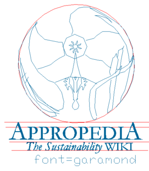
A logo without text is just a logo difficult to trace
The logo need some text
Does it look to match WIKIPERDIA ?
Is it better to have a different unique Appropedia Font style ??
Green ball logo[edit | edit source]
If appealing to a wider audience, the current logo is busy and I think too "alternative", says Peter Campbell of Greenlivingpedia. My response is that Greenlivingpedia's green ball logo has a lot of merit - it definitely has a clean, bright green feel. While the Appropedia logo is cool, it seems likely to appeal to those with hippie inclinations (and I include myself in the hippies, to an extent). Greenlivingpedia's would probably have a broader appeal, IMO, both among the very poor in Indonesia, Peru etc who aspire to a modern comfortable life in an affordable way, and also among those accustomed to modern Western comforts but wanting to be greener. And I don't think the hippies among us will object at all, as long as the site still caters to them - in fact, the strong green will resonate very well. Thoughts? If we end up merging with Greenlivingpedia should we use the green ball logo? (It has my vote.) --Chriswaterguy · talk 01:10, 26 March 2007 (PDT)
New Logo[edit | edit source]
Hi All, What do you think of the new logo and favicon? I was thinking maybe a favicon that included the 3 grey radial parts of the logo... but I like this for now. In addition, we need to keep working on a subtitle. Awesome work, Tressie! --Lonny 18:41, 5 November 2006 (PST)
- I like the new logo a lot! Regarding the favicon, it looks like it was developed from an underlying element of the logo and not the final logo itself. To me, it looks a bit like a daisy, and not like windmill vanes. I uploaded the 9b version of a favicon, which is derived directly from the logo, and which I think looks a bit more like vanes of a windmill, and seems to me to have a clearer linkage with the logo. Not sure how I'd feel about a favicon with the 3 grey radials.
- Having said all that, if the consensus is for "9a" over "9b", I will totally support that. Probably want to develop a consensus quickly, in a day or two. --CurtB 20:44, 5 November 2006 (PST)
- I notice that I no longer get a favicon of any kind, even on my office machine (that I didn't muck around with regarding favicons). Did something happen? I'd be perfectly happy with "9a", since no one else seemed to mind about it. :-) --CurtB 16:50, 14 November 2006 (PST)
- I found this on a dreamhost discussion board about favicons not working:
- http://web.archive.org/web/20071031085738/http://discussion.dreamhost.com:80/showflat.pl?Cat=&Board=3rdparty&Number=52003&page=&view=&sb=&o=
- Take a look... --CurtB 13:51, 15 November 2006 (PST)
- I notice that I no longer get a favicon of any kind, even on my office machine (that I didn't muck around with regarding favicons). Did something happen? I'd be perfectly happy with "9a", since no one else seemed to mind about it. :-) --CurtB 16:50, 14 November 2006 (PST)
Hi All, What do you think of the colors in #13? We could use these as our color palette, and use the three radial color curves in our favicon. Please let me know what you think. --Lonny 10:55, 30 March 2007 (PDT)
- It depends what the logo is for. It's a nice design, but I don't feel it's really suitable for the site as a whole (even with the changed colors). Maybe it would suit an alternative technology or simple living portal? --Chriswaterguy · talk 17:51, 14 April 2007 (PDT)
- Suggestion: How would a simpler version of the current logo look? Tressie, could you try this, just for comparison? A friend from the Endless Solar company told me he really liked the logo, and mentioned the windmill. I'd never seen the windmill, and it's still not at all obvious, so obviously different people notice different things... but I'm particularly thinking about people's first impression, creating an image which is clear and makes an impression on the majority of visitors. So I wonder how it would look if it were a little less ambitious about how much it includes - taking away the cornstalks etc. I am not a graphic designer, nor an artist, so I apologize if my suggestions are too vague! Thanks for your work. --Chriswaterguy · talk 18:45, 19 April 2007 (PDT)
New logo[edit | edit source]
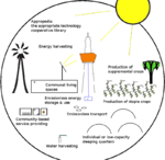

Finished a draft of another logo. This logo has some advantages (as discussed in village pump) but requires some cleanup. KVDP 16:06, 2 November 2009 (UTC)


