
Original file (1,000 × 507 pixels, file size: 118 KB, MIME type: image/png)
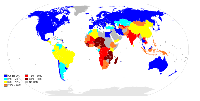
World Map showing the percent of national populations living on less than $1.25 per day. UN Estimates 2000-2007. Map made by Tony0106 (see http://commons.wikimedia.org/wiki/File:Percentage_population_living_on_less_than_$1.25_per_day_2009.svg )
Relevant data can be found at the following link - checking against this image will be advisable, to ensure accuracy: http://data.worldbank.org/indicator/SI.POV.DDAY (This is not a 2009 dataset, however - some data is from "2008-2012" and some is older.)
Important Note: these figures are expressed in PPPW. This is an economics technique to determine the relative power of local currencies. Hence, confusingly, a considerable number of people in this graph may not be living on, in absolute terms, less than $1.25 per day (which itself is in international dollarsW, or the purchasing power in US$ at a given point in time, usually 1990 or 2000).
File history
Click on a date/time to view the file as it appeared at that time.
| Date/Time | Thumbnail | Dimensions | User | Comment | |
|---|---|---|---|---|---|
| current | 08:04, 18 October 2012 | | 1,000 × 507 (118 KB) | KVDP (talk | contribs) | World Map showing the percent of national populations living on less than $1.25 per day. UN Estimates 2000-2007. Map made by Tony0106 (see http://commons.wikimedia.org/wiki/File:Percentage_population_living_on_less_than_$1.25_per_day_2009.svg ) |
You cannot overwrite this file.
File usage
The following page uses this file: