Original file (1,425 × 625 pixels, file size: 39 KB, MIME type: image/png)
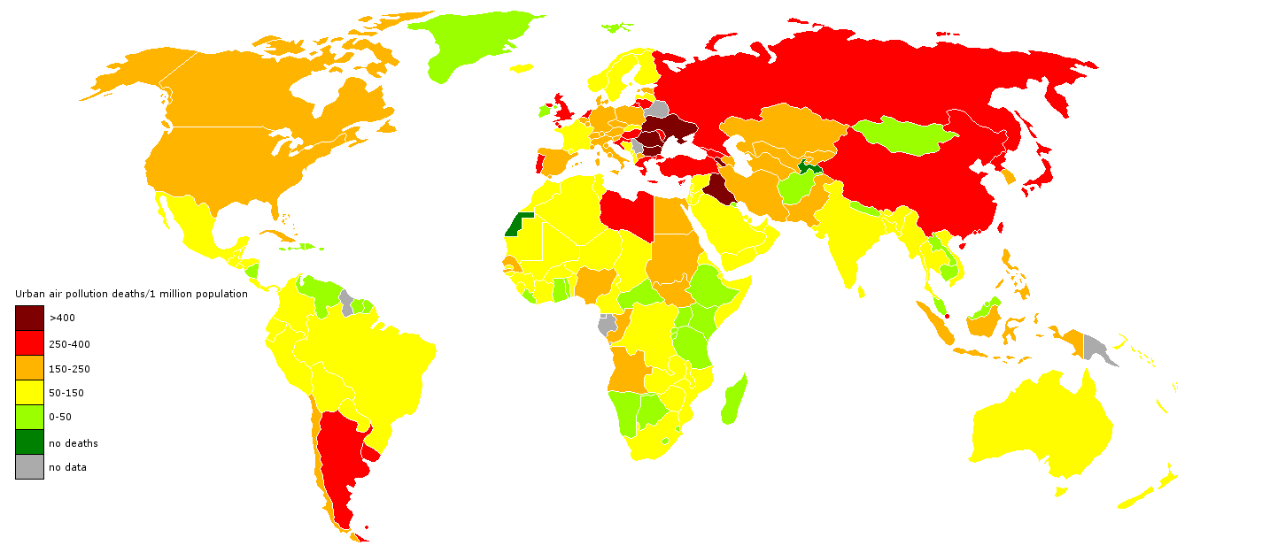
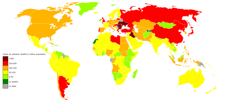
Map showing the number of deaths from air pollution per country. Map was based on a map of the WHO, see http://www.who.int/heli/risks/urban/en/webuapmap.2.jpg and http://www.who.int/heli/risks/urban/urbanenv/en/ This map is accurate for 2004.
It should be noted though that it differed greatly from an earlier map made under the same project (see http://www.who.int/entity/heli/risks/urban/en/webuapmap.jpg and http://www.who.int/heli/risks/urban/en/ ). As such, questions arise regarding the accuracy even of this map. This, especially since this old and even the current map also differ greatly from the ESA map at http://en.wikipedia.org/wiki/File:Global_air_pollution_map.png and the map at http://www.environment.no/Topics/Air-pollution/Local-air-pollution/
File history
Click on a date/time to view the file as it appeared at that time.
| Date/Time | Thumbnail | Dimensions | User | Comment | |
|---|---|---|---|---|---|
| current | 14:15, 19 October 2012 | | 1,425 × 625 (39 KB) | KVDP (talk | contribs) | Map showing the number of deaths from air pollution per country. Map was based on a map of the WHO, see http://www.who.int/heli/risks/urban/en/webuapmap.2.jpg and http://www.who.int/heli/risks/urban/urbanenv/en/ This map is accurate for 2004. It should b |
You cannot overwrite this file.
File usage
The following file is a duplicate of this file (more details):
- File:Deaths from air pollution.png from Wikimedia Commons
The following page uses this file: